Examples of covers and spreads from Reportagen Comparison with a Blackletter typeface.
Comparison of the x-height and the caps with classical serifed typeface.
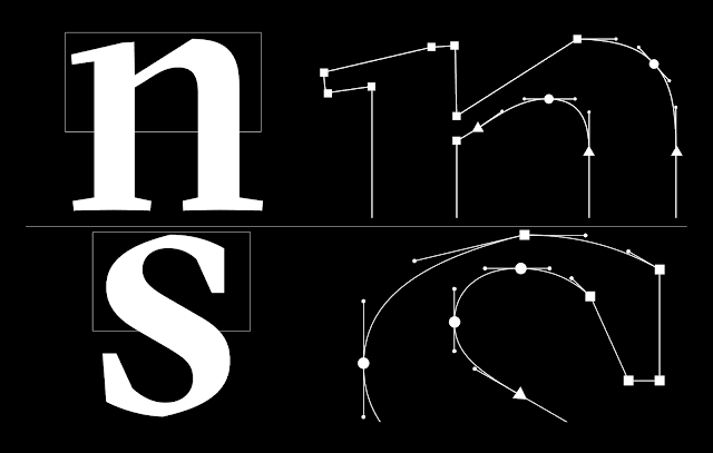
Comparison of the letter “n” rounded and cut and the letter “a” rounded and cut.
Changes from beta to final version
Italics from beta to final
This all comes together to form a large, coherent family suitable for a wide variety of uses. A serif typeface, more than any other, has to be a tool that performs in large and small sizes, on coarse paper or the dense pixel grid of mobile devices. The GT Sectra family, with its three distinct but related subfamilies is, we believe, a very versatile typeface, and we’re excited to see how and where it will be used.
https://ilovetypography.com/2015/01/13/making-fonts-gt-sectra/


No comments:
Post a Comment